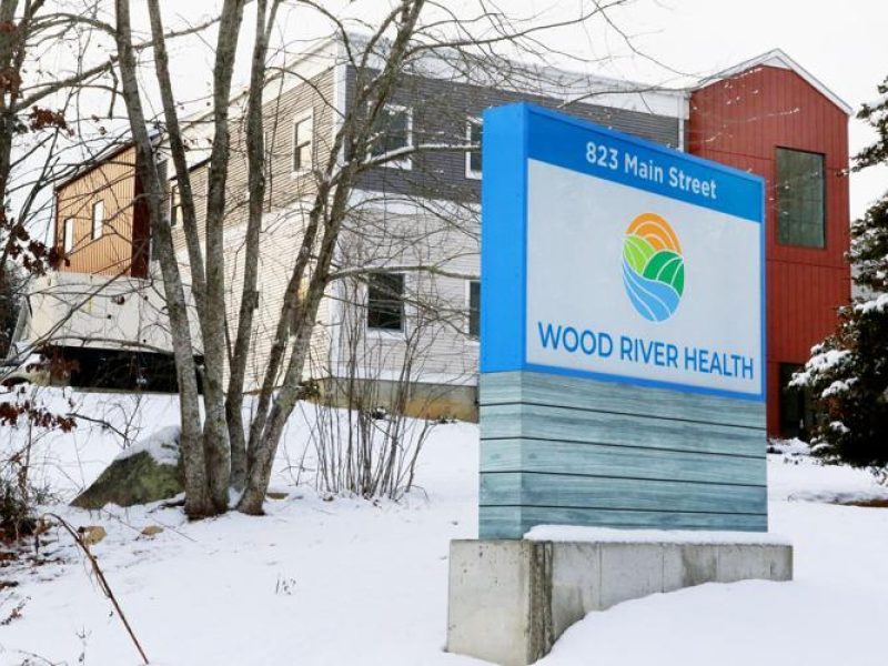
Wood River Health Services has launched its new name, logo and website as a result of its recent rebranding initiative. The name will change from “Wood River Health Services” to “Wood River Health”. With its new name and tagline, “Caring for Our Community Since 1976”, the federally qualified health center’s visual identity now directly aligns with its long-term strategic vision.
After expanding its medical and behavioral health services and social service programs into Westerly and experiencing significant growth at its Hope Valley location, Wood River Health’s Board of Directors recognized an opportunity to rebrand the nonprofit.
“The name Wood River Health preserves the trust we have earned over the past four decades,” shared Regan Pennypacker, Board Chairperson. “We’re more than a service center. We’re a group of caring professionals dedicated to increasing overall health and wellness in our community.”
“Our health center provides a full spectrum of high-quality health care services, delivered by highly trained clinicians in a family-friendly, community environment,” stated Alison L. Croke, MHA, President and CEO. “We secured a local rebranding firm to help us determine if our brand was effectively communicating this message to the members of our community, or if we needed to update our image.”
The nonprofit partnered with local rebranding firm Imaj Associates, Inc. in Spring 2022 to test the current brand, verify assumptions and create a thorough picture of the health center. This process included conducting a feasibility analysis, interviewing internal and external stakeholders, analyzing the findings, and ensuring the results properly reflected the nonprofit’s brand promise and values.
The research findings indicated that significant brand equity had been established in the name “Wood River Health Services” on both the local and state level. In light of this information, the Board voted to shorten the organization’s name to “Wood River Health” in lieu of developing a completely new identity.
When participants were asked to describe the health center in one word, their responses included “affordable”, “convenient”, “local”, “caring”, “community-minded”, “comprehensive”, “dedicated”, “professional”, “reliable”, “patient-centered”, “personable”, “welcoming”, “mission-driven”, “clean” and “safe”. This feedback inspired Wood River Health’s new tagline: “Caring for Our Community Since 1976”.
Interviewees also shared that they believed the logo needed to be modernized to better reflect the high-quality healthcare that is provided by the health center. Wood River Health’s CEO and Development and Marketing team worked with Imaj Associates, Inc. to develop and refine its vibrant new logo, which features an orange sun, a pair of green hills and blue river in a circle.
“Wood River Health’s new logo better represents its mission, growth and commitment to its community,” shared Jami Ouellette Morse, President and Creative Director of Imaj Associates, Inc. “The bold yet welcoming colors, drawn from the natural beauty of the area, were selected to connect with patients and help them feel positive, bold and hopeful through their lifetime health care journeys. The interconnection of the individual elements (the water, the land and the sun) represents Wood River Health’s strong partnerships with the medical community, its patients and its donors.”
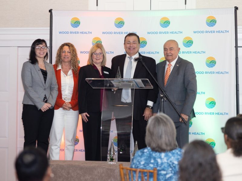
Imaj Associates was recognized by the international, highly acclaimed Muse Creative Awards for their work on the Wood River Health rebrand. The Muse Creative Awards values professionals whose inspiration flows through every aspect of their work and honors those demonstrating a deep knowledge and understanding of their craft. With their concepts, ideas, or designs, these creatives light a fire in others to strive further, thus becoming a muse.
“Wood River Health’s rebranding represents far more than a new color palette and logo,” stated Alison L. Croke, MHA. “Our new image effectively communicates our renewed vision to serve as a model for excellence in health care delivery and as a leader in promoting the health and well-being of the members of our community.”
Once the logo and tagline were confirmed, the organization switched its focus to updating its marketing material and website. “Our new circular logo resonates wholeness and unity, representing the integrated services Wood River Health provides to its patients across their lifespans,” stated Sarah Channing, MSBA, Director of Development and Communications. “Moving forward, each of our five departments will be represented by one of our logo colors. This color scheme will be carried across our flyers, brochures and website platform so patients can quickly identify the health care services they are seeking.”
Wood River Health secured LDM Designs to assist with developing its marketing material and Envision Technologies Advisors, LLC to translate its modern rebranding into a new website that is secure, easy to navigate, and ADA-compliant.
LDM Designs has successfully created beautiful and timeless designs for a wide variety of clients for over 20 years. “I am delighted to be asked to assist Wood River Health with translating its new logo and designs across its printed materials,” stated Lia McAlpine, owner of LDM Designs. “It’s a tremendous organization and I feel its new branding truly mirrors its commitment to serving the members of our shared community.”
Envision Technologies Advisors, LLC is a leading technology consultancy that supports businesses and non-profits nationwide. “Health services organizations are near and dear to our hearts, and Wood River Health is one of the very best,” said Envision’s Strategic Account Consultant David Cordeiro. “Our developers went above and beyond to create a digital experience that could scale with them, and also help them fulfill their mission,” he concluded.
WoodRiverHealth.org will launch on November 28, 2022.